Warm White vs Cool White Paint: How to Choose the Right Shade
- Ar. Ashutosh Garg
- 2 hours ago
- 9 min read
📅 Published: June 20, 2025 | 🔄 Last Update: June 20, 2026 | ⏱️ Read Time: 14 min read
TL;DR
Warm white and cool white paint create very different moods in a home. Warm white has yellow, cream or beige undertones that feel cozy and traditional. Cool white has blue, grey or violet undertones that feel crisp and modern. The right choice depends on your flooring, furniture, metal finishes and the natural light in each room. Lighting direction and bulb type can also change how a white shade looks after sunset. This guide explains how to test shades properly so you avoid an expensive repainting mistake.
Table of Contents
Quick Comparison: Warm White vs Cool White Paint
Comparison Point | Warm White Paint | Cool White Paint |
Common undertones | Yellow, cream, beige or peach | Blue, grey, green or violet |
Overall feeling | Soft, cosy and welcoming | Crisp, clean and modern |
Best interior styles | Classic, traditional and transitional | Modern, minimalist and contemporary |
Suitable flooring | Beige stone, cream tiles and wood | Grey tiles, white flooring and concrete |
Suitable metals | Brass, bronze and gold | Chrome, silver and black |
Best rooms | Bedrooms, living rooms and dining areas | |
Appearance in low light | Usually feels softer | May appear grey or dull |
Main concern | Can look yellow | Can look blue or clinical |
Choosing white paint should be simple. Yet the moment you open a shade card, you see cream white, pearl white, ivory white, grey white, snow white and many more options that look almost the same.
The real difference often comes down to warm white vs cool white paint.
A warm white can make a room feel comfortable and inviting. A cool white can make the same room look cleaner, brighter and more modern. However, the wrong undertone may clash with your flooring, furniture, lighting or wall finishes.
The best white is not necessarily the brightest one. It is the shade that works naturally with the light and materials already present in your home.
This guide will help you understand the difference between warm white paint and cool white paint, where each one works best and how to test them before making the final choice.
What Is the Difference Between Warm White and Cool White Paint?
The main difference between warm and cool whites is their undertone.
Warm white paint contains subtle yellow, cream, beige, peach or red undertones. These undertones give the room a softer and more welcoming appearance,creating a sense of comfort and warmth that makes spaces feel cozy, inviting, and relaxing.
Cool white paint usually carries hints of blue, grey, green or violet. It creates a cleaner, sharper and more contemporary look.
These undertones may not be clearly visible on a small shade card. They become more noticeable when the paint is applied across a full wall or placed beside flooring, cabinets and furniture.
Warm White Paint

Warm white is suitable for interiors that already contain warm materials and colours. It works especially well with:
Wooden furniture and flooring
Beige or cream stone
Brass and gold finishes
Tan, rust and brown fabrics
Cane and rattan furniture
Warm yellow lighting
It is often used in traditional, classic and transitional interiors because it makes the space feel relaxed rather than overly bright.
Cool White Paint

Cool white is better suited to interiors with clean lines and a modern colour palette. It pairs well with:
Grey or white flooring
Black-framed windows
Chrome and silver fittings
Blue and green furnishings
Concrete or cement textures
White and grey modular furniture
It can make a well-lit room appear fresh and spacious. However, in a dark room, an excessively cool white may look grey or slightly blue.
Common Mistakes Before Choosing the Correct Tone of White Paint
Selecting a white paint colour without considering the room’s natural and artificial lighting.
Testing paint samples in only one area instead of checking them throughout the room at different times of the day.
Assuming all white paints look the same and overlooking undertones such as yellow, pink, blue, or grey.
Choosing a paint colour based solely on online images or showroom displays.
Ignoring existing elements in the room, such as flooring, furniture, countertops, and trim colours.
Picking the brightest white available without considering the desired mood and atmosphere.
Failing to compare multiple white shades side by side before making a final decision.
Not using sample swatches or test patches on the actual walls before purchasing paint.
Overlooking how the paint finish can affect the appearance of the chosen white tone.
Following trends without considering whether the shade complements the specific space and décor.
How Does Room Lighting Affect Warm White vs Cool White Paint?
Lighting can completely change how white paint looks. A shade that appears balanced in a showroom may feel yellow, blue or dull inside your home.
That is why the warm white vs cool white paint decision should always be made inside the actual room.
1. Natural Daylight

Rooms receiving strong daylight can usually handle cooler and brighter whites. Natural light prevents the walls from looking too grey or flat.
Rooms with limited daylight often benefit from warmer whites. The soft undertone can prevent the room from feeling cold or lifeless.
The direction of sunlight also matters:
East-facing rooms receive warm morning light and cooler light later in the day.
West-facing rooms become warmer and more golden during the afternoon.
North-facing rooms generally receive softer and cooler daylight.
South-facing rooms usually receive stronger and warmer daylight for longer periods.
A warm white may become too creamy in a strongly sunlit west-facing room. Similarly, a cool white may feel dull in a dark north-facing bedroom.
The Bureau of Energy Efficiency also highlights the role of windows and reflective interior surfaces in managing natural illumination. This supports a practical design rule: wall colours should be studied under the actual daylight conditions of the space.
2. Artificial Lighting

Artificial lighting is equally important because most homes are used heavily after sunset.
Warm yellow lights strengthen the cream and beige undertones of warm white paint. This combination can feel soft and comfortable, especially in bedrooms and living rooms.
Neutral lighting gives a more accurate view of the paint colour. It is useful for kitchens, wardrobes, dressing rooms and workspaces.
Cool white lights can make cool white paint look sharper. However, using both cool paint and cool lighting in a bedroom may create an overly formal or clinical atmosphere.
How Can Flooring, Furniture and Temperature Help You Choose the Right White?
White walls should not be selected separately from the rest of the interior. Flooring, cabinets, doors and furniture strongly influence how the paint undertone appears.
Match the Flooring Undertone
Flooring covers a large surface area and usually stays unchanged for many years. It should therefore be one of the first elements considered.
Beige and cream flooring generally works with warm white.
Grey and charcoal flooring usually suits cool white.
Natural wooden flooring works well with warm or balanced neutral white.
White flooring may support either shade depending on its undertone.
Patterned flooring should be matched with its dominant warm or cool colour.
Place the paint sample directly above the floor. This makes clashing undertones easier to identify.
Consider Fixed Interior Elements
Permanent features such as wardrobes, kitchen cabinets, stone counters and door finishes should guide the paint choice.
For example, a blue-toned cool white paint placed beside an ivory wardrobe may make the wardrobe look yellow. A creamy white placed next to bright white kitchen cabinets may make the wall appear dirty.
Temporary décor items such as cushions and artwork can be changed later. Fixed elements are more expensive and difficult to replace, so the paint should coordinate with them first.
How Does Space Affect White Paint Undertones?
The size, layout, and natural light of a room can significantly influence how white paint undertones appear. In smaller spaces, warm white paints often create a cozy and inviting feel, while cool whites can make the room feel crisp but sometimes slightly stark. Larger rooms with abundant natural light tend to reveal undertones more clearly, making it important to test paint samples throughout the day.
Which Marble Pairs Best with White Paint?
Choosing the right white paint also depends on the marble finishes used in your home. Coordinating undertones between paint and stone creates a more cohesive and balanced design.
Carrara Marble: Features soft gray veining and pairs beautifully with cool white paints that have subtle gray or blue undertones.
Calacatta Marble: Known for its bold veining and warmer appearance, it works well with neutral or slightly warm white paints.
Statuario Marble: Combines crisp white backgrounds with dramatic gray veining, making it a great match for clean, balanced whites.
Crema Marfil Marble: Its beige and cream tones pair best with warm white paints that have creamy or soft yellow undertones.
Arabescato Marble: With a mix of gray veining and warm movement, it complements versatile whites that sit between warm and cool.
Before finalizing a paint color, compare samples directly against the marble surface in both natural and artificial lighting. This helps ensure the undertones work together rather than competing with one another.
Which White Paint Works Best in Different Rooms?
Room | Recommended White | Why It Works |
Living room | Warm or neutral white | Creates a comfortable atmosphere and suits wood, beige fabrics and layered lighting |
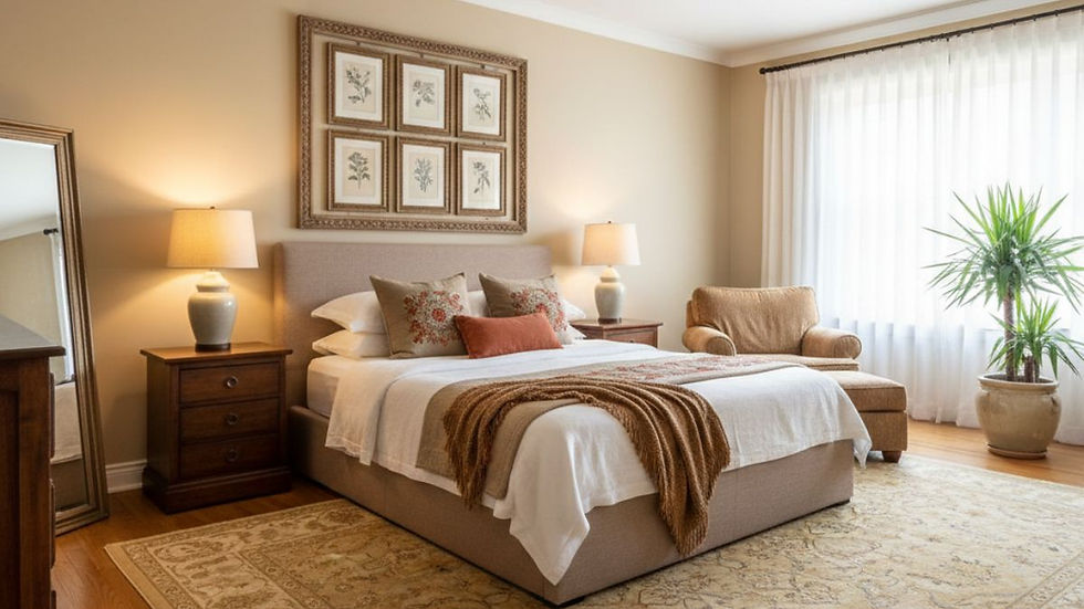
Bedroom | Warm white | Feels softer and more relaxing under evening lights |
Modern kitchen | Cool or neutral white | Gives cabinets and counters a cleaner, sharper background |
Traditional kitchen | Warm white | Works well with wooden cabinets, beige counters and warm tiles |
Bathroom | Cool white | Creates a fresh look with grey, blue, black or white tiles |
Cool or neutral white | Supports a bright and focused work environment | |
Warm white | Makes the setting feel welcoming and comfortable |
How Should You Test White Paint Before Finalising It?
Never select white paint using only a printed shade card or online photograph. Screens and printed samples may not show the true undertone.
Test the paint on a large board or directly on different walls. Apply the recommended primer and at least two coats so that the existing wall colour does not affect the result.
Follow This Testing Process
Paint a large sample instead of a small patch.
Place it beside the flooring and fixed furniture.
Check it in the morning and afternoon.
Observe it again after sunset.
Switch on the final room lights.
Move the sample to different walls.
Compare it with the ceiling colour.
Study the sample for at least two days. The shade may look different on a wall facing the window and another wall receiving less light.
You should also check the product specifications before painting. The Bureau of Indian Standards lists IS 15489:2013 for plastic emulsion paint. CPWD specifications also emphasise proper wall preparation, including the removal of dust, grease, loose material and stains before paint application.
Good-quality paint can still look uneven if the wall has moisture, poor putty work or an unsuitable primer.
How Can You Make the Final Choice Between Warm and Cool White?

Begin with the permanent elements in the room. Check whether the flooring, wardrobes, doors, counters and furniture carry warm or cool undertones.
Next, observe how much natural light enters the room. Bright rooms can usually support cooler whites, while low-light rooms often feel better with warm or balanced white shades.
Then look at the artificial lighting. A room used mainly during the evening should be tested under the lights that will actually be installed.
Choose warm white paint when you want the room to feel:
Comfortable
Soft
Welcoming
Traditional
Relaxed
Choose cool white paint when you want the room to feel:
Bright
Clean
Modern
Open
Structured
The right answer in the warm white vs cool white paint debate is not based on the shade name alone. The best white is the one that connects naturally with your flooring, furniture and light.
Testing the actual shade inside the room is the simplest way to avoid an expensive repainting mistake.
Designer Insight: Paint color is only one part of the overall look, its finish matters too. Matte finishes create a soft, elegant appearance and help hide minor wall imperfections, while satin or semi-gloss finishes are easier to clean and work well in high-traffic areas. Choosing the right finish can enhance both the style and practicality of your space.
FAQ's
Is Warm White or Cool White Better for a Bedroom?
Warm white is usually better for bedrooms because it creates a softer and more relaxing atmosphere under evening lighting.
Does Cool White Paint Make a Room Look Bigger?
Cool white can make a bright room feel more open and spacious, especially when paired with simple furniture and light flooring.
Can Warm White and Cool White Be Used in the Same House?
Yes. Different whites can be used in separate rooms, but visible connecting spaces should have coordinated undertones.
Why Does White Paint Look Yellow at Night?
Warm lighting highlights cream and yellow undertones. Always test the paint under the room’s final artificial lights.


Comments